Aesthetic : Color Pallete

“What are your wedding colors?”
This is probably one of the most common questions – after “when’s the big day?” – asked by strangers or acquaintances to show genuine interest in one’s wedding planning, and for most people it’s also the easiest question to answer. You can easily change your mind about your processional song or cake flavor, but wedding colors permeate through the entire planning process from beginning to end. The idea of a color duality dominates everything, from the invitations to the flowers and the apparel to the programs. Furthermore, the colors a couple chooses can immediately give insight into what kind of people they are. Red-and-white: a classic couple. Hot pink and black: a fun-loving couple (or bride). Pale blue and yellow: an easy-going couple. You get the idea.
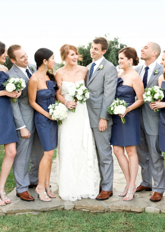
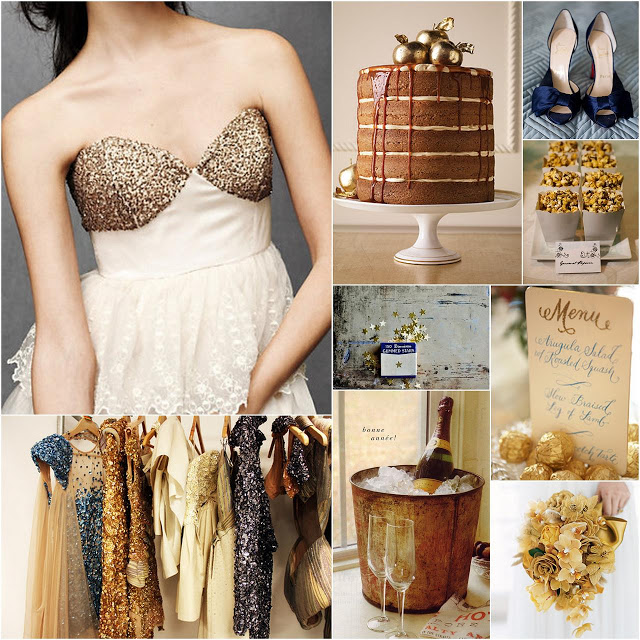
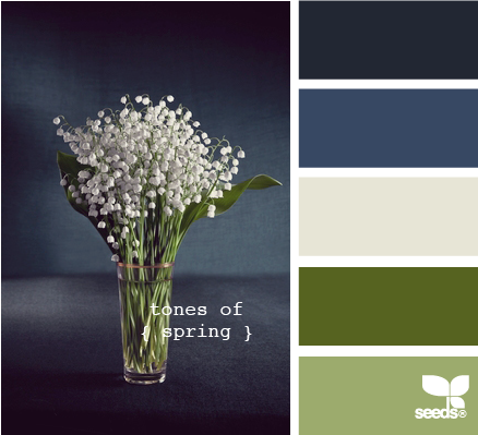
So when I was asked this simple question at least 10 times over the weekend, you would think I’d have a straightforward answer like every other normal person. But alas, one of the biggest personality traits that Ben and I share is a desire to break rules and be a little different than everyone else. Today, I’ll advocate the concept of wedding color palettes. I personally feel that wedding style is moving away from the matchy-matchy look and more toward inspiration similar to interior design; thus, I’ve confidently deviated from the tradition of two distinct wedding colors and have opted for an array of complimenting tones and textures instead. Officially, I’ve been calling our color palette ‘navy and natural:’ a mix of navy (inspired by the sapphires in my ring), leafy greens, wooden tones, and cloudy gray and white.

Color palette inspiration can come in multiple forms: basic color swatches, a collage of photos or elements you like, or even just a single image. As far as I’m concerned, chevron, sequins, lace, glitter, or wood are all viable patterns and textures that can be included along with your colors. Here’s a great example of a wedding that has done exactly that, and I think it’s fabulous and fashion-forward! Notice how the gray, lavender, pink, navy and creams in the bridal party’s attire all look classic and complimentary, but not rigid. The greenery in the bouquets provides a nice contrast to the muted tones. They’ve added sparkly elements and chevron for pops of modernity and fun. The combination of these design elements would translate nicely to a living room or little girl’s room, don’t you think?

{ Original photo from Postcards and Pretties }
Although I certainly acknowledge that it’s not for everyone, there’s my pitch for the wedding color palette. If assembling design elements seems as daunting as renovating your kitchen, you can hire a wedding designer just to create the “look” of your wedding (although I bet that costs a pretty penny). However, whenever I have spent a few minutes fretting over what vase filler to use in my centerpieces or worrying about the absence of an aisle-runner, I think of an important piece of wisdom courtesy of APW: you won’t remember how your wedding looked, you’ll remember how it felt. While all of this flower-centerpiece-creative-color-palette nonsense is extremely fun for me now, I truly hope that I’ll look back on my wedding day and remember smiling faces and the feeling of joy above all else.
We hope you enjoyed this article about choosing wedding colors. Tune in next month to read about choosing a wedding venue.

comments +